


Most SaaS products lose the majority of their trial users before those users ever experience the product's real value. That's not a marketing problem or a pricing problem: it's an onboarding problem. In fact, onboarding accounts for 30-50% of churn variance, making it the single highest-impact area you can improve in your entire product experience. And yet, most teams treat it as an afterthought: a few welcome screens, a product tour nobody asked for, and a drip email sequence that reads like it was written by committee.
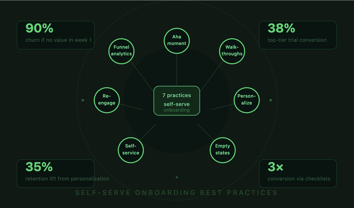
The companies winning at product-led growth have figured out something different. They've built self-serve onboarding flows that feel intuitive, personal, and fast. They don't rely on a sales rep or a customer success manager to hold every new user's hand. Instead, they design the product itself to teach, guide, and convert. The best practices for building these self-serve onboarding experiences aren't complicated, but they do require a shift in how you think about your product's first impression. Here are seven that actually move the needle.
The old playbook was straightforward: generate a lead, hand it to sales, schedule a demo, close the deal, then pass the customer to a CSM for onboarding. That worked when software was expensive and buyers had patience. Neither of those things is true anymore. Buyers expect to try before they buy, and they expect to figure things out on their own.
This is why PLG has become the dominant growth model for SaaS. The product does the selling. The product does the onboarding. And the product determines whether someone converts or churns. The average SaaS trial-to-paid conversion rate sits around 25%, though top performers hit 38.2% by personalizing their onboarding and using data to guide users toward activation.
Self-serve onboarding isn't about removing humans from the equation entirely. It's about making the default experience good enough that most users don't need a human. When you get this right, your sales and success teams can focus on high-value accounts instead of hand-holding every free trial user through basic setup. The seven practices below are the foundation for building that kind of experience.
Every product has a moment where the user "gets it." For Slack, it's sending a message in a channel and getting a reply. For Canva, it's finishing a design in under five minutes. For your product, it's something specific, and your entire onboarding flow should be engineered to get users there as fast as possible.
The reason this matters so much is stark: roughly 90% of users churn if they don't grasp a product's value within the first week. That's not a typo. Nine out of ten. Your onboarding isn't competing with other products for attention: it's competing with apathy, distraction, and the back button.
As one industry expert put it, "Onboarding isn't a phase: it's the entire first date. If you're still talking about yourself after 10 minutes, there won't be a second." That framing from a recent analysis of onboarding trends should shape how you think about every screen in your first-run experience.
To find your Aha moment, compare the behavioral patterns of users who retained versus those who churned. Pull cohort data from your first 7 and 30 days. Which actions correlate most strongly with conversion? Maybe it's creating a project, inviting a teammate, or connecting a data source. Whatever it is, that action becomes your North Star for onboarding.
Don't guess. Run the analysis. Look at your best customers and work backward. If 80% of your retained users completed a specific action within 48 hours of signup, that's your activation event. Build everything around getting new users to that point.
Every field in your signup form is a potential exit point. Every unnecessary step between "Create Account" and "First Value" is a leak in your funnel. Audit your signup flow ruthlessly. Do you really need a company name at signup, or can you ask later? Does the user need to verify their email before they can touch the product?
Some of the highest-converting SaaS products let users start working immediately and defer account verification. Others use social login to collapse the signup process into a single click. The goal is simple: reduce the number of decisions a new user has to make before they experience something useful.
Static product tours are dead. You know the ones: a series of blue bubbles pointing at UI elements, explaining what each button does, with a "Next" button that users click through as fast as possible just to dismiss them. That's not onboarding. That's a slideshow.

Interactive walkthroughs are different. They ask users to actually perform actions: click this button, type in this field, select this option. By doing the thing instead of reading about it, users build muscle memory and context simultaneously. The completion rates for interactive walkthroughs are dramatically higher than passive tours because they feel like using the product, not watching a tutorial about it.
Tooltips work best when they're contextual and triggered by user behavior, not dumped on users all at once. A tooltip that appears when someone hovers over a confusing icon is helpful. Five tooltips stacked on top of each other during first login is overwhelming.
Modals should be reserved for critical moments: welcoming a user, collecting segmentation data, or celebrating a milestone. Use them sparingly. If your onboarding has more than two or three modals in the first session, you're probably over-communicating.
There's solid evidence that users who complete an onboarding checklist are 3x more likely to become paying customers. Checklists tap into the completion bias: once someone starts checking off items, they feel compelled to finish. Progress bars reinforce this by showing how close they are to "done."
The key is keeping checklists short. Three to five items is the sweet spot. Each item should map directly to an activation behavior. "Complete your profile" is filler. "Send your first invoice" is valuable. Make every checklist item earn its place.
A project manager and a developer signing up for the same tool have completely different goals, vocabulary, and expectations. Showing them the same onboarding flow is like giving everyone the same pair of shoes and hoping they fit. Personalization based on user role or intent can lift 7-day retention by 35%, which is one of the most impactful improvements you can make.
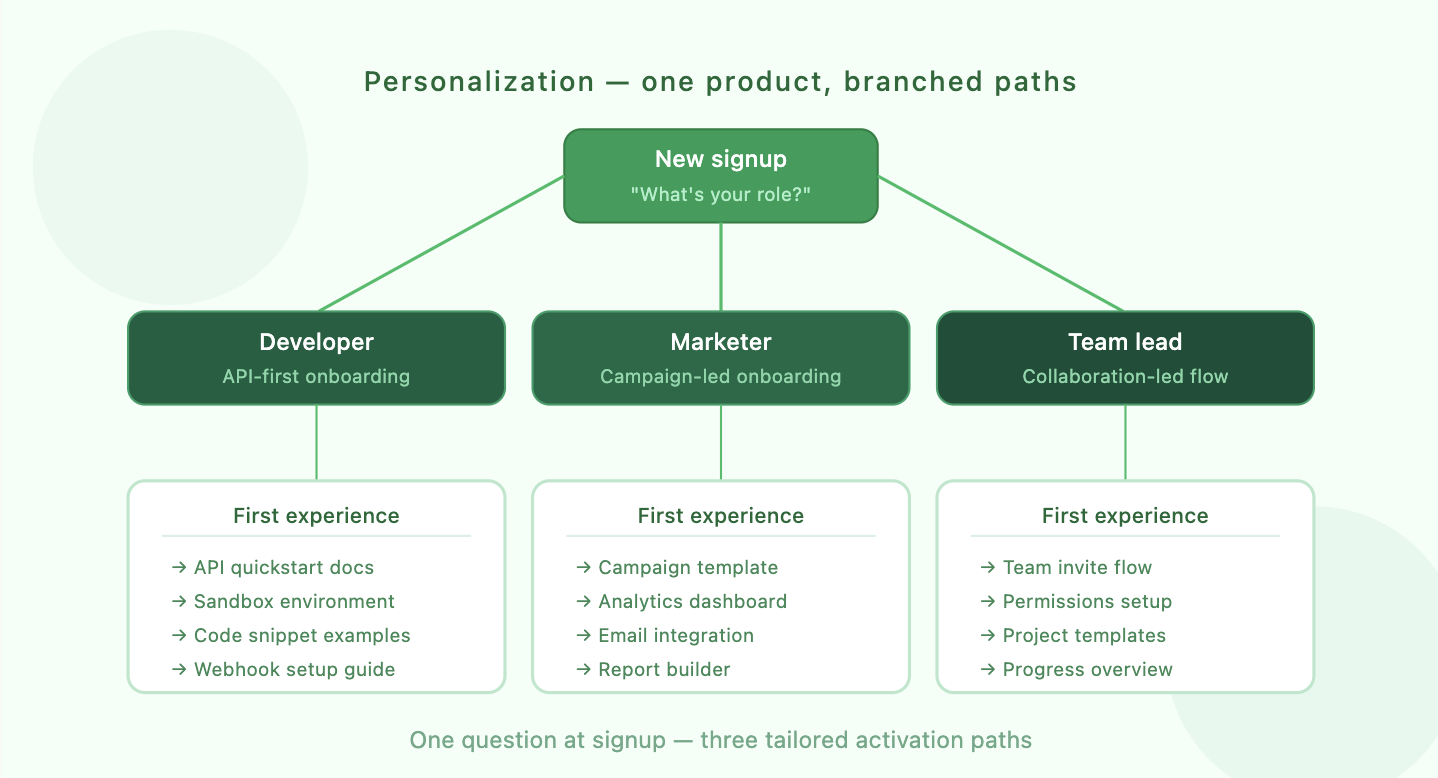
The simplest way to personalize is to ask. A single screen after signup: "What's your role?" or "What are you hoping to accomplish?" gives you enough signal to branch the onboarding experience. You don't need an AI model for this. You need a welcome survey and two or three tailored paths.
Build your segments around the jobs users are trying to do, not just their titles. A "marketer" who wants to build landing pages needs a different first experience than a "marketer" who wants to analyze campaign performance, even though they'd select the same role from a dropdown.
Start with two or three segments. You can always add more later. Map each segment to a specific activation path: which features should they see first, which templates should be pre-loaded, which checklist items matter most. This isn't about building entirely separate products. It's about changing the order, emphasis, and examples within the same onboarding framework.
The first time a user opens your dashboard, their project list, or their analytics view, it's empty. Most products handle this with a blank screen and maybe a "No data yet" message. That's a missed opportunity.
Empty states are prime real estate for education. Instead of a blank table, show sample data that demonstrates what the product looks like when it's working. Instead of an empty chart, display a mock visualization with a clear CTA: "Connect your data source to see your own metrics here." Notion does this well with its template gallery. Figma does it with starter files. The pattern is the same: show users what "good" looks like before asking them to build it themselves.
Think of empty states as micro-onboarding moments scattered throughout your product. Each one is a chance to teach a concept, motivate an action, or reduce the anxiety of a blank canvas. They're especially powerful because they appear exactly when the user needs guidance: at the moment they encounter a new feature for the first time.
Not every question happens during the guided onboarding flow. Users get stuck at odd hours, in unexpected places, with questions your product tour never anticipated. A self-service resource center gives them a way to find answers without submitting a ticket and waiting 24 hours.
The best resource centers are embedded directly in the product, not hidden behind a "Help" link that opens a separate website. They include searchable articles, short video walkthroughs, and contextual suggestions based on the page the user is currently viewing. The goal is to resolve questions in under 60 seconds without the user ever leaving the app.
A knowledge base is table stakes. But the real value comes from smart surfacing: showing the right article at the right moment. If a user is on the integrations page, the help widget should prioritize articles about setting up integrations, not billing FAQs.
Chatbots can handle the gap between self-service articles and live support. A well-trained bot can answer common questions, link to relevant docs, and escalate to a human when it recognizes it's out of its depth. The key is making the bot genuinely useful, not a frustrating gatekeeper that forces users through a decision tree before letting them talk to a person.
Your onboarding doesn't end when the user closes the browser tab. Most users won't complete activation in a single session. They'll sign up, poke around for a few minutes, get distracted, and forget about your product. Multi-channel re-engagement brings them back.
The channels you use matter less than the timing and relevance of the messages. A generic "Come back!" email sent three days after signup is noise. A specific "You started setting up your first project but didn't finish: here's a 2-minute video showing the next step" email sent 4 hours after the user dropped off is useful.
Structure your email sequences around activation milestones, not arbitrary time intervals. The first email should fire when a user signs up but doesn't complete a key action within a few hours. The second should trigger when they've completed one milestone but not the next. Each email should have a single, clear call to action tied to a specific product behavior.
Push notifications and in-app messages work similarly but require even more restraint. Nobody wants to be bombarded with notifications from a product they just started using. One well-timed nudge beats five generic reminders every time.
You can't improve what you don't measure. Every self-serve onboarding flow should be instrumented with event tracking so you can see exactly where users drop off, which steps take the longest, and which paths lead to conversion versus abandonment.
Build a funnel visualization that maps each step from signup to activation. If 1,000 users sign up and only 200 reach your Aha moment, you need to know which of the intermediate steps is losing the most people. Is it the data import step? The team invitation screen? The first feature interaction? The answer tells you exactly where to focus your effort.
The metrics that matter most for onboarding are activation rate, time-to-first-value, onboarding completion rate, and trial-to-paid conversion. Track these by cohort so you can see whether changes you make actually improve outcomes over time, not just in aggregate.
Behavioral cohort analysis is far more useful than demographic segmentation here. Group users by what they did, not who they are. Users who connected an integration in their first session versus those who didn't. Users who invited a teammate versus solo users. These behavioral splits reveal the actions that actually predict retention.
Treat your onboarding flow like a living system, not a set-and-forget feature. Run A/B tests on specific steps: does a 3-item checklist outperform a 5-item one? Does asking for the user's role before or after the first action change completion rates? Does a video walkthrough convert better than an interactive tour?
Test one variable at a time. Run tests long enough to reach statistical significance. Document your results in a shared repository tagged by funnel stage and confidence level so your team builds institutional knowledge over time. The best onboarding flows are the result of dozens of small, compounding improvements, not a single brilliant redesign.
These seven practices for self-serve onboarding aren't independent tactics to cherry-pick from. They work together as a system: personalization makes your walkthroughs more relevant, analytics tell you where to focus your testing, and re-engagement brings users back to complete the activation path you've designed. The companies that treat onboarding as a continuous, data-informed process are the ones hitting those top-tier conversion rates.
If you're building or rethinking your self-serve onboarding experience and want expert guidance on activation strategy, Flow helps SaaS companies design onboarding flows that convert trial users and reduce churn, whether you're going fully self-serve or building a hybrid model. Get in touch to see how they can help.
The real takeaway is this: your product's first five minutes determine whether someone becomes a customer or a statistic. Make those minutes count.


